Role
Lead product designer
Date
2021-2024
Assignment Type
Full-time embedded in their team as a product design lead.
Team


Online Payment Platform (OPP) is a Dutch payment provider that enables online payments for platforms and marketplaces. I’ve partnered with their small team to help them redesign their consumer-facing products and their brand.
Context
Via my company Square One I worked for a period of 2 years as a contractor for Online Payment Platform. First, for a few months to redesign their brand. Then, after a year of working with Riverside.fm, I was asked by OPP's founder to redesign their consumer-facing products full-time with their team.
Achievements
🪄
Increased qualitative sales leads
By refreshing the brand and sharpen the audience
✨
Reduced support questions
By redesigning three consumer-facing products
🔎
Set-up a research & design process
That fitted in with the rythim of their engeneering team.
🌱
Hired & mentored a designer
To pick up market design taks and help with product related tasks.
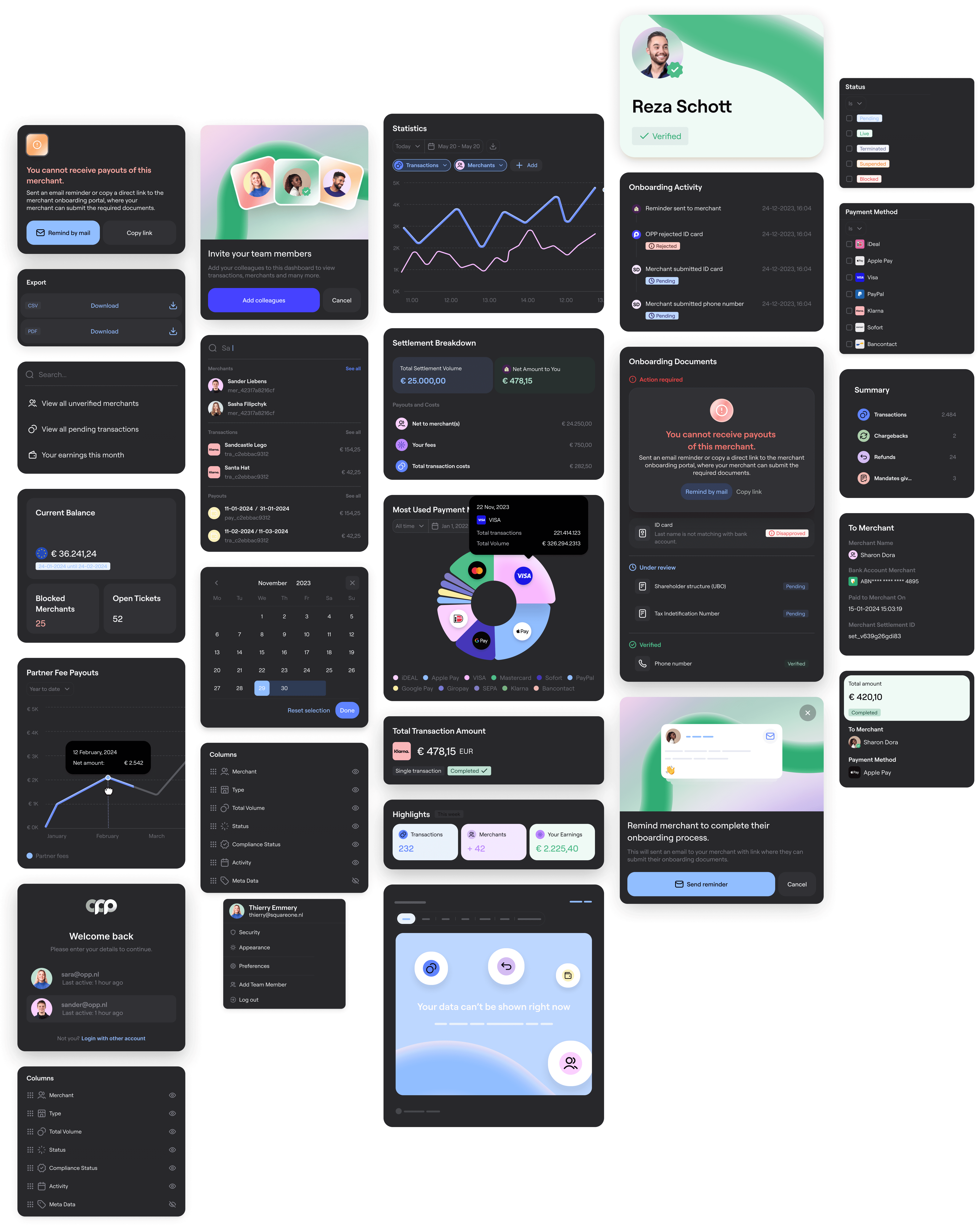
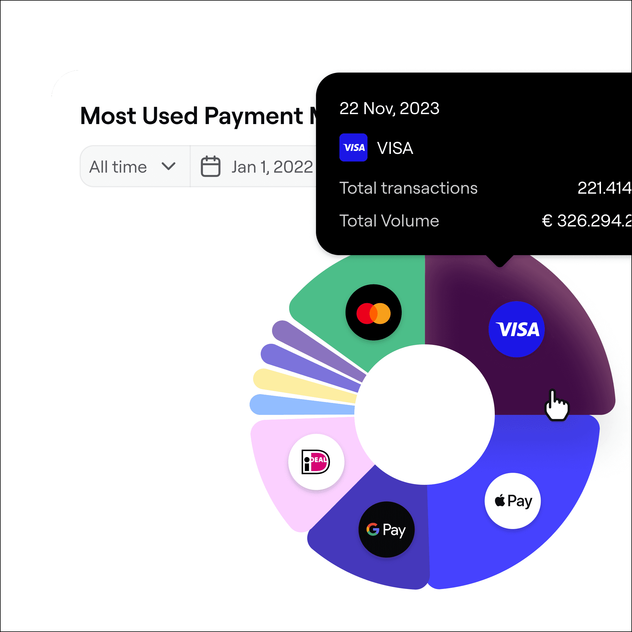
Redesign the dashboard of OPP's clients
For platforms using OPP as their payment provider, the partner interface is their central place to monitor and manage all financial activity happening on their platform.
Tracking transactions, overseeing merchants, seeing how much money they’ve earned, checking which users are verified or not—essentially, making sure everything runs smoothly when it comes to finances.
I led the redesign of this interface from the ground up, starting with user research to understand workflows and pain points. I worked with the team to prioritize features, validate assumptions through user testing, and create prototypes.
From writing product specs and detailed Jira tickets to collaborating with developers on a new design system, I was involved every step of the way. We took the project through implementation and QA, ensuring the design was both user-friendly and scalable.
The result? A reimagined dashboard that gives platforms full control over their financial operations and the tools they need to make better decisions.


John Doe
Verified
Mike Brown
Verified
Lisa Jones
Verified
Tom White
Verified
Alice Green
Verified
Chris Black
Verified
Ann Grey
Verified
Sam Hill
Verified
Kate Bell
Verified
Jack Wood
Verified
Emma Fox
Verified
Matt Stone
Verified

User testing
During the redesign, we reached out to 10 clients to test prototypes and validate our assumptions. These sessions weren’t just about usability—they gave us a window into their workflows and how they interacted with OPP’s services. By observing their processes, we identified potential frustration points and areas where our partner dashboard could make a real impact.
We also took this opportunity to gather broader insights on their experience with OPP, which helped us highlight key opportunities to the leadership team. This way, the redesign wasn’t just about improving the interface—it became a tool to shape better service and strategy across the board.
Redesign Onboarding
Still in progress. But we focussed on mapping out the whole onboarding journey and see where our onboarding team and user flows could help each other doing things more efficiently.


Work in progress
Rebrand
Together with my co-founder we rebranded Online Payment Platform. I helped OPP with creating a brand language, animations, social media templates, marketing campaign pages, to help them set-up their identity for their new b2b →. b2c focus.
Impact
Making an impression on potential clients
After the rebrand, the sales team started hearing new kinds of feedback from potential clients. Comments like, “It feels modern now,” and, “This feels much more approachable,” came up in conversations. The updated look and feel didn’t just catch attention—it made clients more comfortable engaging with OPP, setting it apart from competitors.
Improving the sales pitch
We worked closely with the sales team to rework their pitch. The goal was to simplify the story and make it visually engaging. By refining how services were presented, the team found it easier to guide clients through complex topics, turning difficult conversations into clearer, more productive ones.
Building an inclusive brand
Inside the company, the new brand had an impact too. Team members mentioned how much more inclusive and modern it felt, and new hires echoed the same sentiment. HR even noticed a rise in job applicants, showing how the rebrand strengthened OPP’s appeal both externally and internally.
Payoff
I came up with the pay-off 'paving the way to pay'. We extended it to align it more with the previous payoff which was 'Let everyone pay everyone'.
The new one emphasised more that OPP enables the infratructure for others to pay - hence paving the way, to pay.
Paving
the way
for everyone
to pay
Swoosh
Mascotte shape and used in infographics.
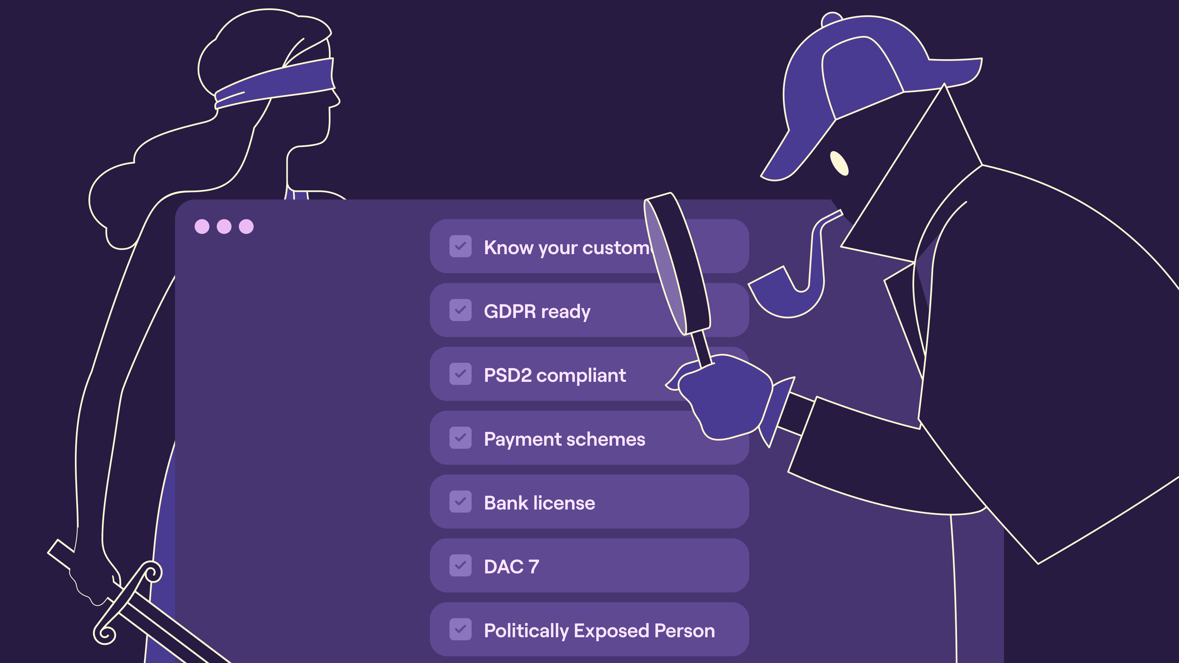
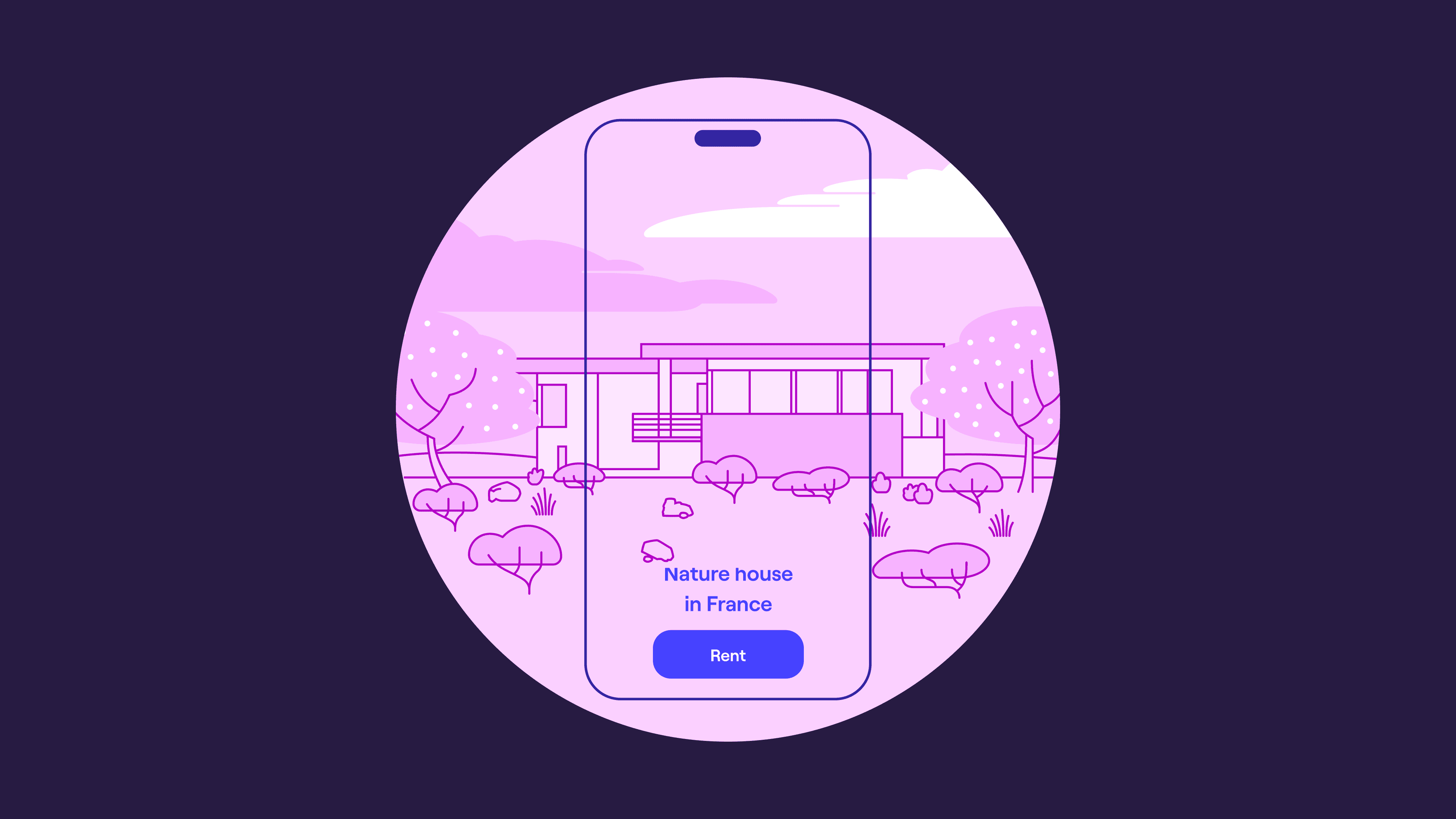
Illustrations and animations
I asked Iwan to design a set of characters for illustrations we could use in a brand video that OPP wanted to show potential clients and investors. Our approach was collaborative—I worked on the color schemes while Iwan focused on the illustrations. Together, we developed a few playful concepts to visually explain OPP’s payment products in an engaging way.
To bring the brand video to life, I teamed up with Nacho Darras on the animation. Later, we collaborated again to create the animation for the partner interface, ensuring it aligned seamlessly with the brand’s visual style.
New logo, colors, visual, typography and illustration style
After exploring a range of options with Richard, the founder, we decided on a circular concept as our main direction. I asked Dylan to give this idea a try, and he created a shape that became our primary logo.
Building on that, I developed a visual style with a new color scheme and a playful element we called “the Swoosh”—a colorful path that represents different layers of the payment process. This element turned out to be especially useful in infographics, where we could illustrate payment flows in a clear, engaging way.
Templates & Guidelines
To make it easy for people internally, like the sales teams making journey's, or PR posting social media posts, we created a few templates in Canva covering them with tools they use reguraly. I created a living brand document in Figma to give other designers a source of inspiration of how to work with the brand genereally.


Checkout, Mediattion and more
Currently working on improving other white labeled solutions like the checkout and mediation toolings to improve support queries.
Reflections

Over the past two years we dealt with so much. Limited engeneering capacity, responding to investor needs, tech- and design debt. My key take away is that it's when a company has a primary focus on their core offering, the secondary focus (like their consumer facing products) can change the course of their core focus. We pivoted quite some times from deciding what features would impact internal operations vs our users. By creating a small scope, testing our efforts, we were able to not just redesign the products, but work towards the vision of the founder. Step by step, a little closer.